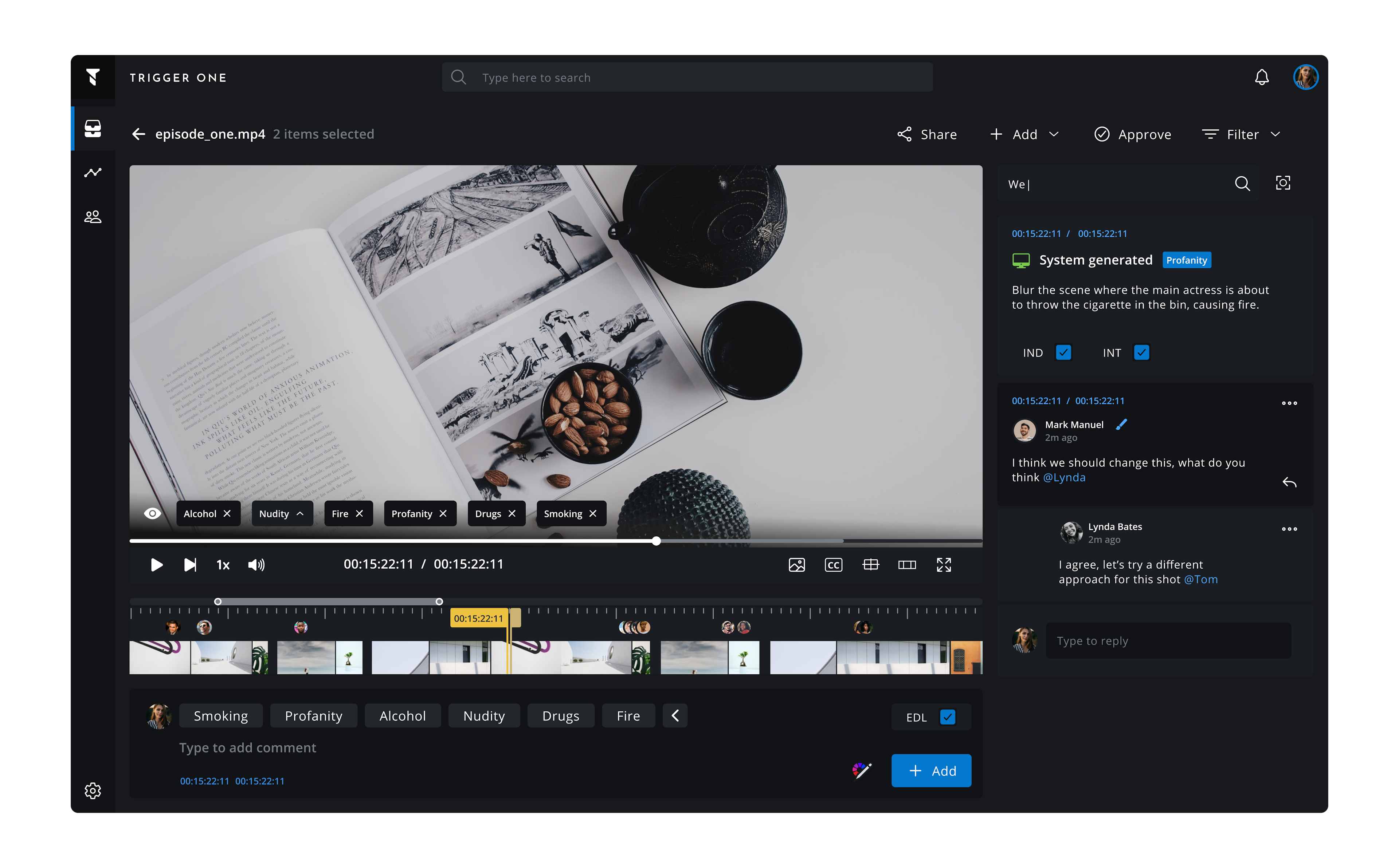
Trigger One is a Media Asset Management system that allows organizations and teams to come together and collaborate on media files. This includes large production and distribution houses like Sony, Disney, and Viacom, and also smaller teams in agencies or startups.
My role
I led the design team at Tessact, and I was responsible for front-end architecture, having written the front-end for most of our products during the early stage of the company before we had a full front-end engineering team established.
This unique position helped establish a close knit link between front-end and design by building novel processes that helped ship products and features at a much faster rate.
Why build a design system
Tessact as a company had grown so much and our team was rapidly expanding. Our products were getting more mature, and we've been onboarding new clients much more frequently.
As our design and front-end teams grew, we realised an increasing need for structure that would enable us to deliver more consistent experiences to our customers. We wanted to also make sure that new designers who were onboarding to the team would be able to leverage existing work efficiently — especially novel interaction patterns that we had tried and tested for specific complex scenarios in the media production and post-processing industry.
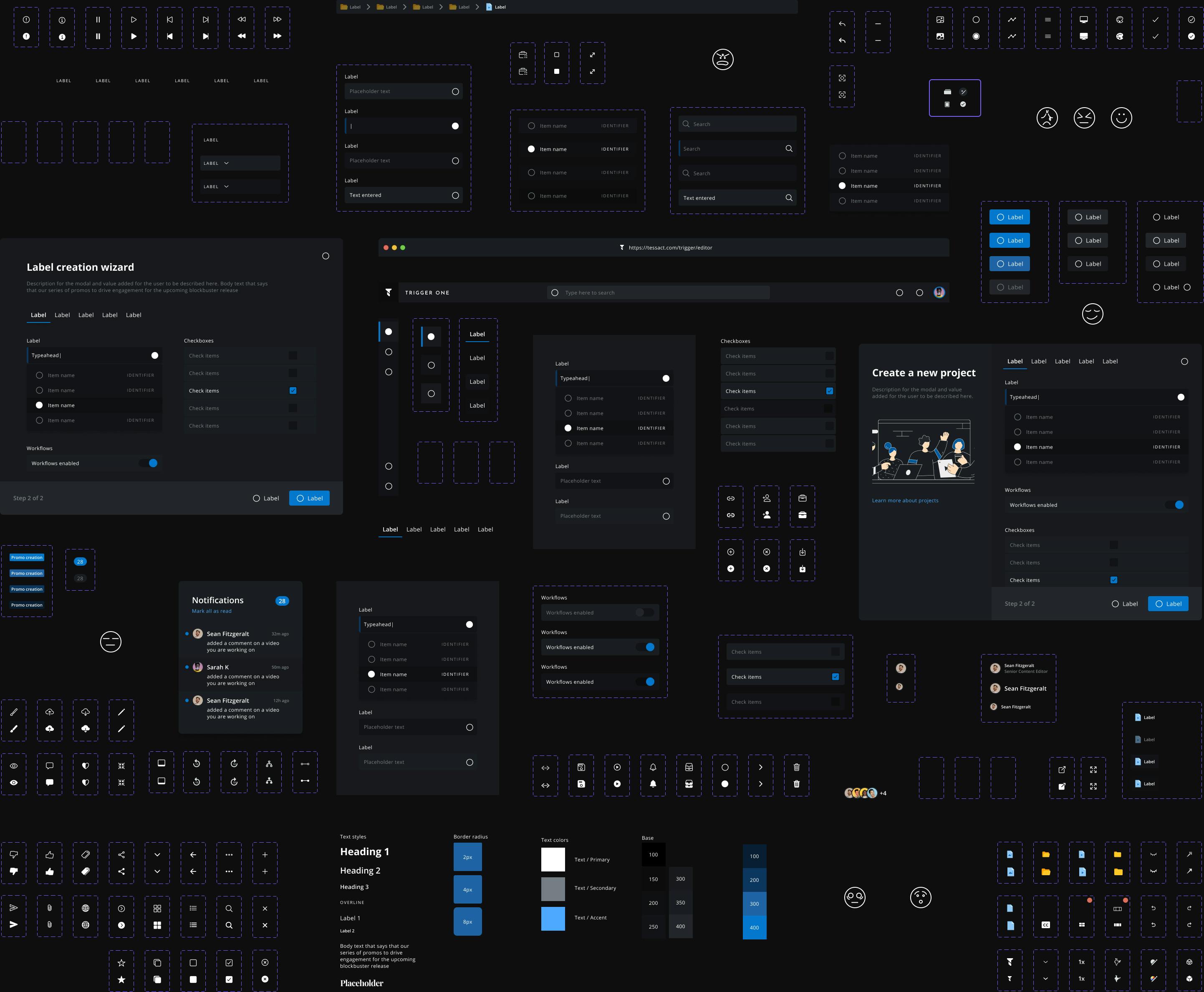
Having a scalable and consistent system of design patterns, UI elements, process, and documentation was the right answer.
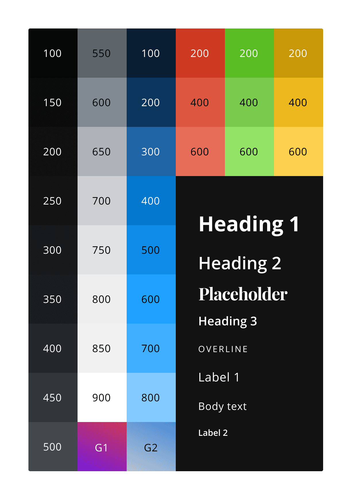
Design tokens
For a scalable design system that has just the right amount of wiggle to grow, we needed to de-couple values like colors or type styles from the context they are used in.
These are tokens, and they can be used in varying levels of specificity. However, if the value of the token changes, it'll update everywhere automatically.
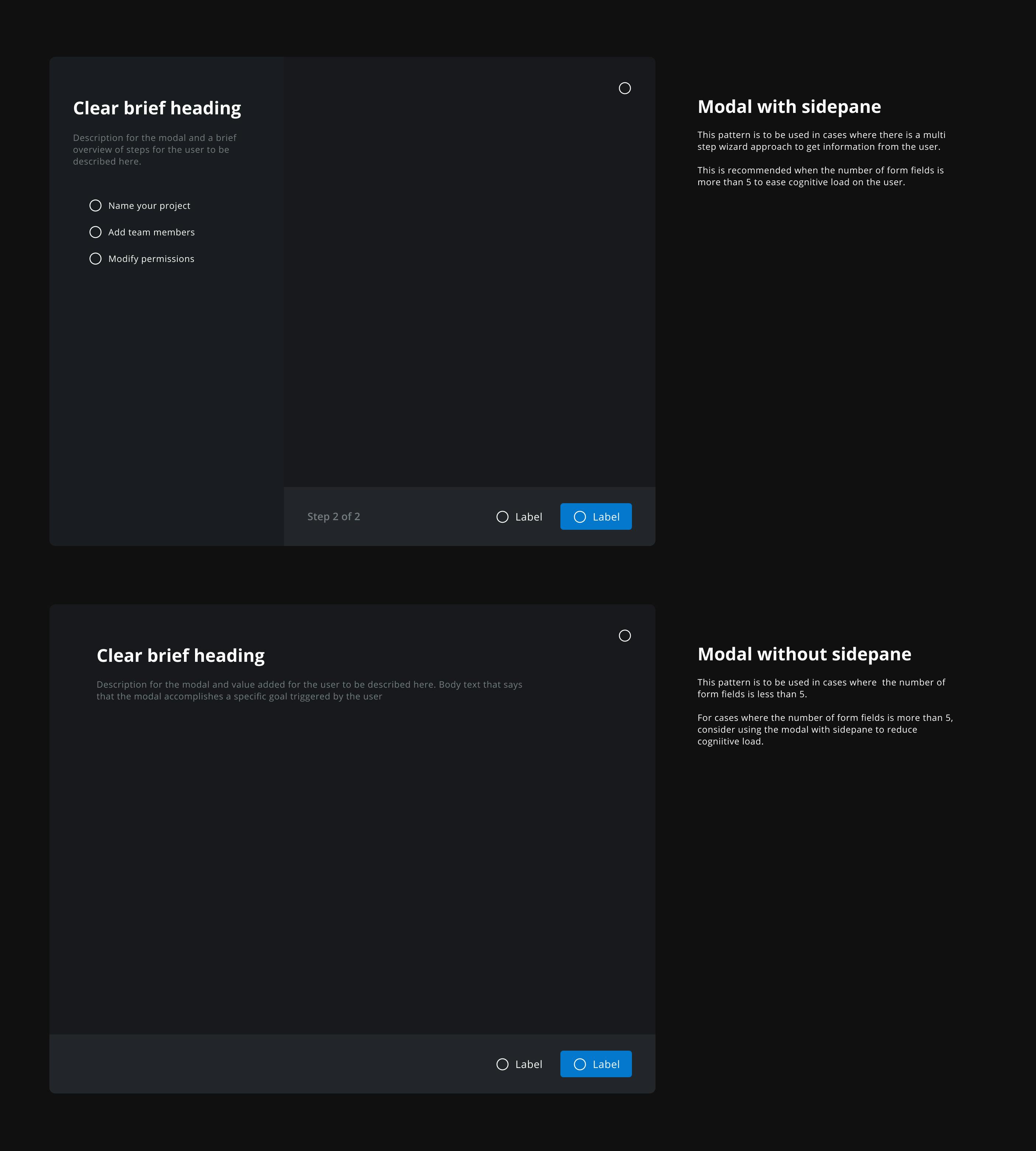
Experience patterns
Having crafted experiences for our enterprise customers for over 3 years, with constant iteration based on feedback, we knew what worked and what didn't.
It was time to standardise the patterns that we knew worked so that there is consistent experience direction across and within products. Validated patterns were coupled with guidelines and tied to higher order components.
Visual style
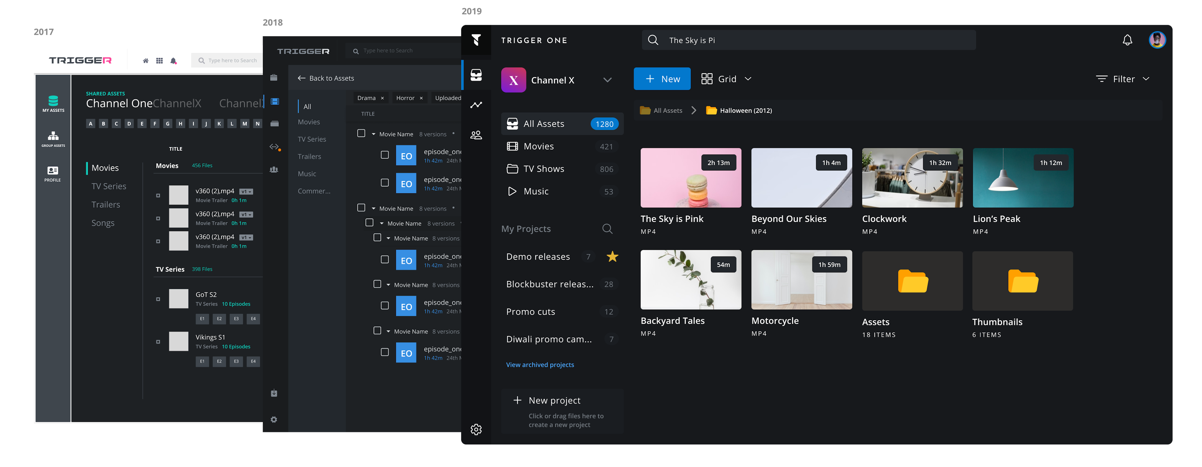
Over the last 3 years as our company and products matured, our visual language and style changed significantly.
While initially being very focused on our enterprise features, we now also wanted to target consumer clients and small teams.
As we geared up for public self-service release, we wanted our visual design to mirror our ideology and convey a sense of openness, transparency, and trust, while not being intimidating.
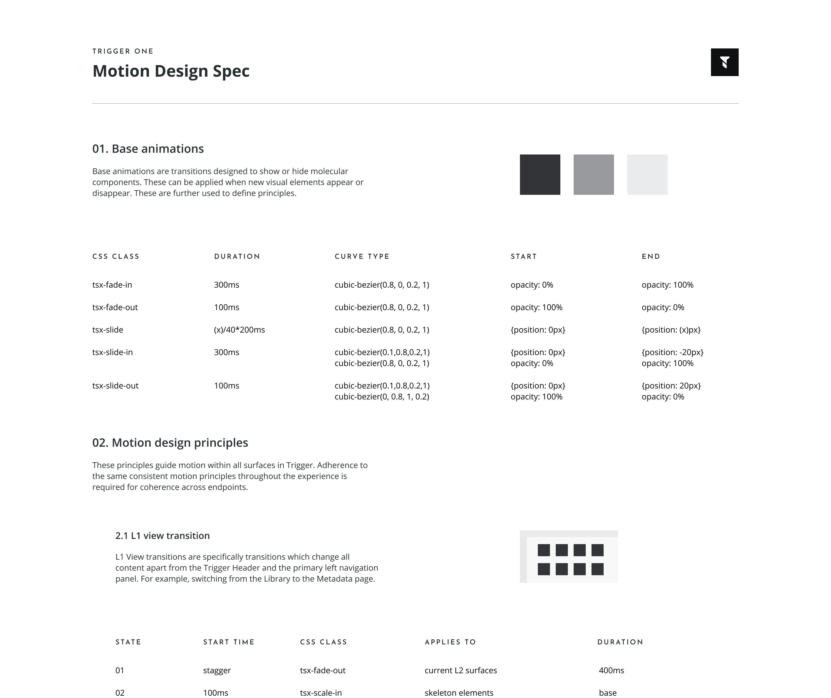
Motion design
Once we had built our product, things felt quite static.
Of course we could css transitions to buttons and controls, but that would still only make it feel like a website, we wanted our product to feel like a native app with buttery smooth transitions all around.
This was an ambitious goal, we didn't have the time or the resources to meticulously add transitions to every component or flow.
This was an ambitious goal, we didn't have the time or the resources to meticulously add transitions to every component or flow.
So we built a motion framework that let us programmatically add transitions to the entire system through carefully defined principles. We tokenised easing functions and applied them to specific types of UI interactions, which were then applied to DOM elements.
Front-end architecture
As I was responsible for the front-end architecture as well in Tessact, the design system was deeply integrated in the way our product was structured.
Components and tokens were translated with the system serving as a single source of truth. We used tools like storybook and framer to build and maintain parity between assets used in the design as well as on the front-end of our products.
This improved the time taken to build and test new features massively. We had a workflow in place to build and review new components before they went into the process and designers were regularly involved in front-end code reviews.
This improved the time taken to build and test new features massively. We had a workflow in place to build and review new components before they went into the process and designers were regularly involved in front-end code reviews.
This paradigm improved collaboration between the design and front-end teams and helped think through and make design changes as a systemic level instead of at a feature level.
Tech stack
We used react for all our front-ends and worked to maintain styling and tokens separate from functionality.
We used styled-components to manage styling within a framework that we built. Styles are always managed at the component level with utility components supporting complex layouts.
One of the principles in place was to make sure that we never had any page-specific styling. Layouts were reused within the logic of layout components and made it easier to scale the app to include experiences like custom panel layouts.
Performance
Performance metrics were tracked on every commit and we had minimal reliance on third-party libraries. We made sure that not a single line of CSS was getting loaded that was not used for the view that the user was in at that time. Motion was handled by framer-motion and relied on the motion specs to apply consistent performant motion principles across the board preventing unnecessary browser re-draws.
Would you like to know more?
Most projects showcased here are just sneak peeks into the work that went in and are not case studies.
If you'd like to know more about any of them, drop me an email and we can catch up. I usually respond within a day.
Most projects showcased here are just sneak peeks into the work that went in and are not case studies.
If you'd like to know more about any of them, drop me an email and we can catch up. I usually respond within a day.
hi@naveen.io
Built for performance | See the tech inside →