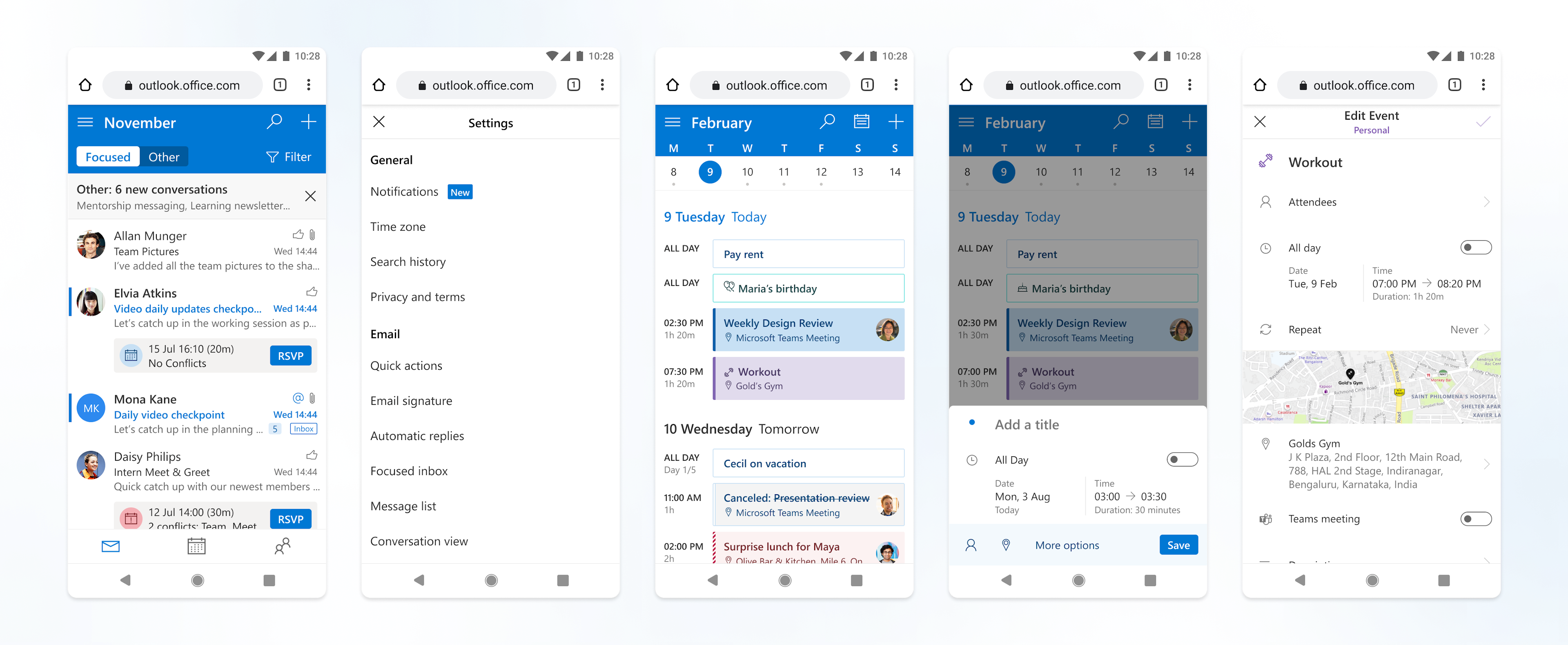
With over 75M monthly active users Outlook on the mobile web is Microsoft’s flagship product on mobile web and has been setting standards on how mobile web apps should be designed within Microsoft.
Outlook on the mobile web was going through a period of growth with tons of new features being added that help growth and retention.
Overview
Building the design system for Outlook on the mobile web
Challenges
Over the years many designers have contributed to the product through new features, redesigns, and improvements. Some of these were committed straight to code, some of them we'd lost the designs for, and a lot of them were living on Sketch files in someone's hard drive.
There was inconsistency in UX patterns, typography, and styles in the shipped product.
We wanted to build a single source of truth that supports all designers working on new features. This unity and consistency would also allow us to build experiences like dark mode.
My role
I was responsible for building and maintaining the entire design system as well as all supporting documentation for it.
I closely collaborated with the front-end engineering team in understanding how best to structure and build a single source of truth for both teams. I also drew on learnings from, and contributed to, other design system efforts within Microsoft.
Context
Why invest in a design system at this stage?
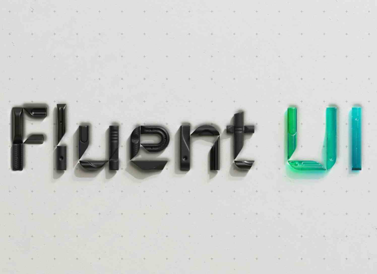
Fluent and Fabric
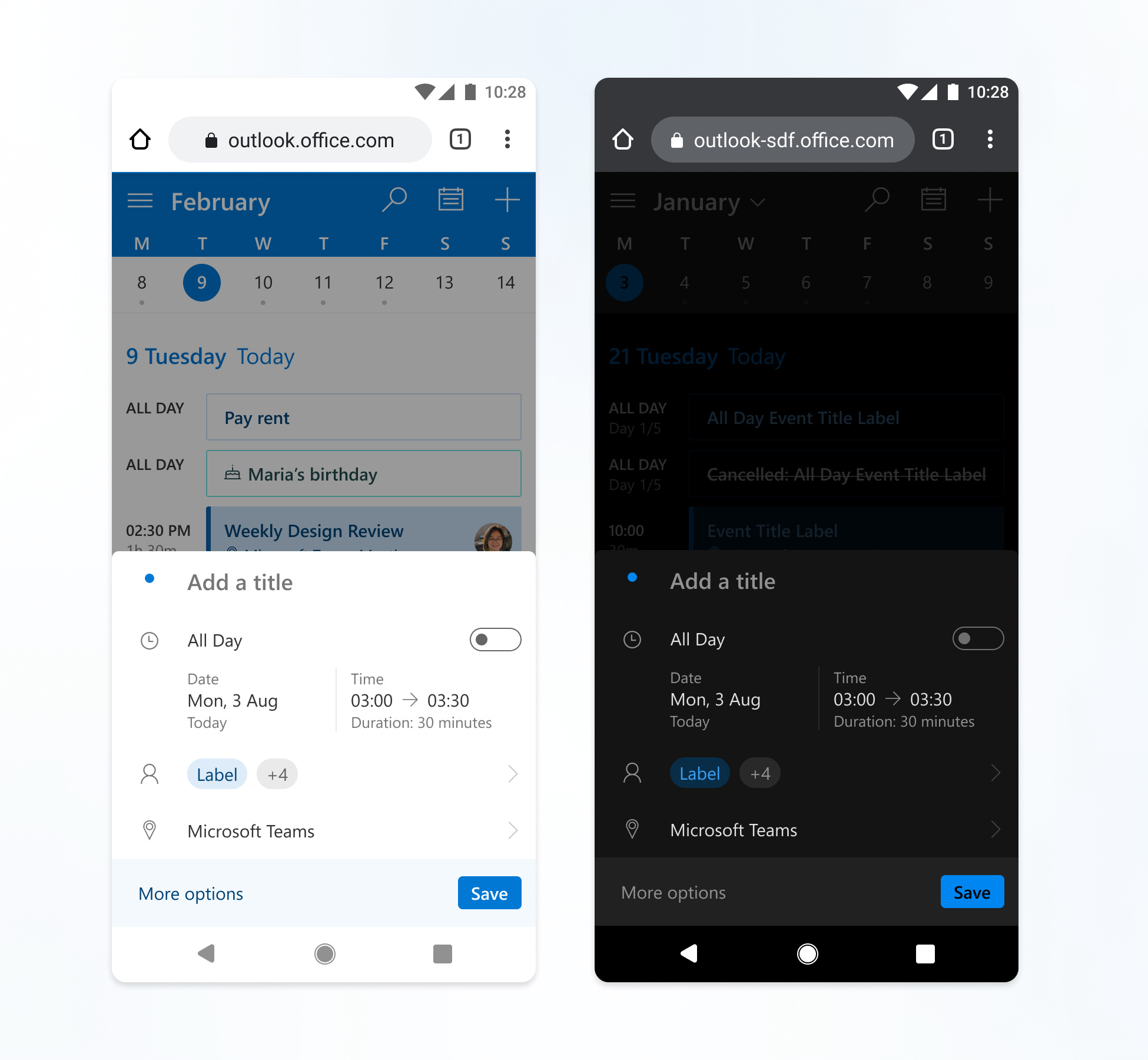
The Outlook web app followed the older Microsoft fabric design language, while most of the mobile and mac apps were using the newer Fluent design language.
Since there was no clear guidance set for mobile web apps, the product team had chosen to align with the Outlook web style of using the older Fabric design language, but adapting it for the mobile web.
This made sense then as it was indeed rendering on a browser. However, Fabric as a design language was crafted for desktop web experiences and we had to change a whole lot to accommodate mobile web needs like wanting larger touch targets and expecting touch gestures.
This gave rise to an unique style for Outlook on the mobile web that did not fit into any of the existing design systems, and needed it's own.
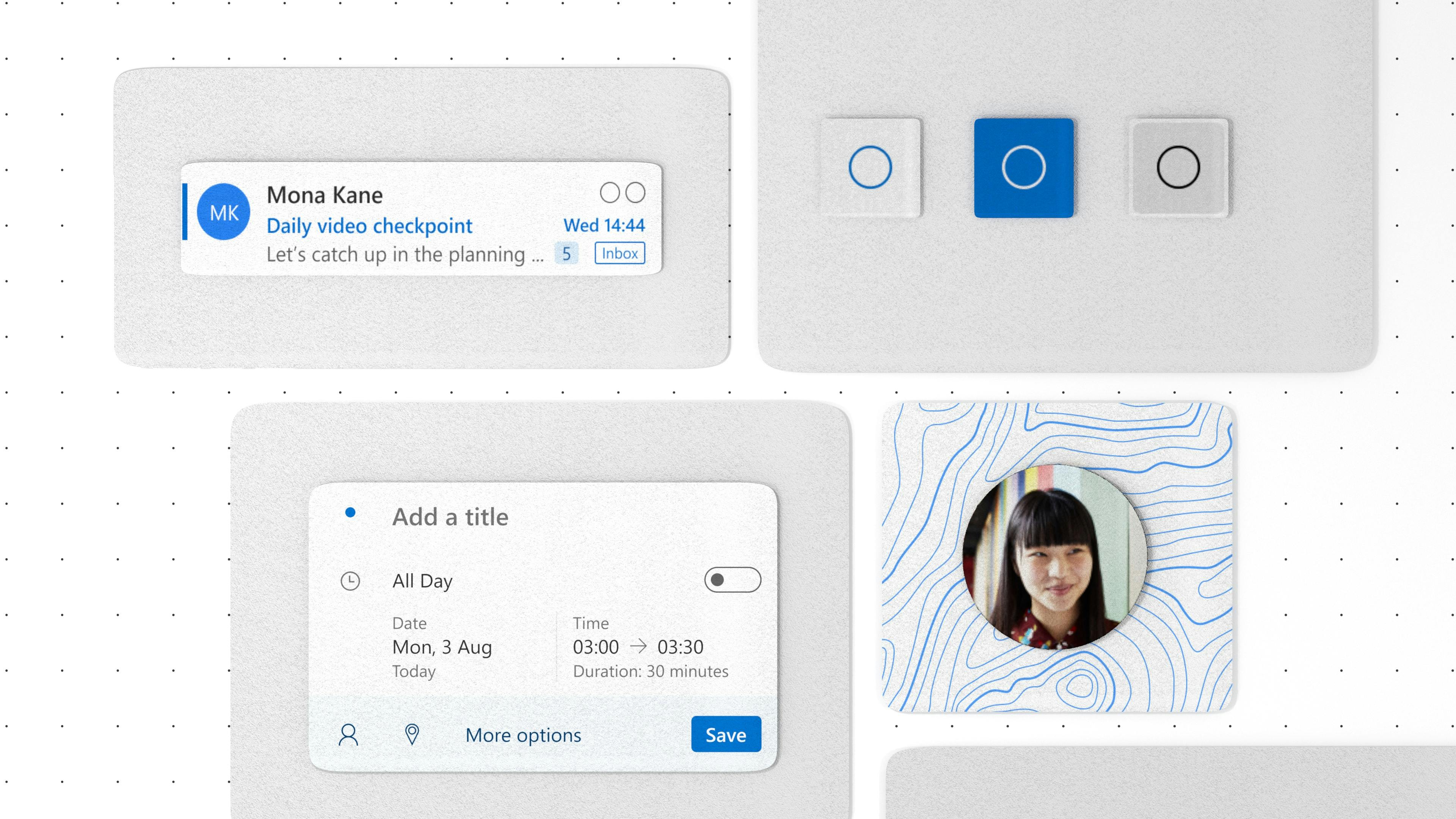
Shareable controls
Outlook on the mobile web served parts of its functionality up as shareable components that could be integrated into any other Microsoft app.
This meant that our UI elements and experience needed to scale up to even serve large-screen and cross app requirements.
This required a great deal of structure, consistency, and documentation across the board - something which could be brought in through a design system that would be leveraged by our growing team as well as partner teams that want to consume these shareable controls.
Dark mode
As more and more apps around the world started adopting dark mode for their apps, it was no longer just a value-add, it became an expectation.
Implementing a dark mode experience required a system to already be in place with the right tokens across different levels of components.
Sketch to Figma migration
As an organization, Microsoft was moving to Figma during this time, and away from sketch. It meant adapting to a new, more open way of collaborating on design.
This seemed like an ideal time to invest in a scalable design system taking advantage of all the collaboration and open design features that Figma offered.
This design system would also serve as a model for other teams within Microsoft who were building design systems on Figma.
The process
There needed to be a fine balance between how the product worked now and how it should work once the design system had been implemented.
We want to bring in consistency, but we also want to be very intentional about the impact of the system in how the product behaves.
To that end, we wanted the product to be as close to how it is, while making minimally invasive systemic changes for structure, clarity, and consistency in experience.
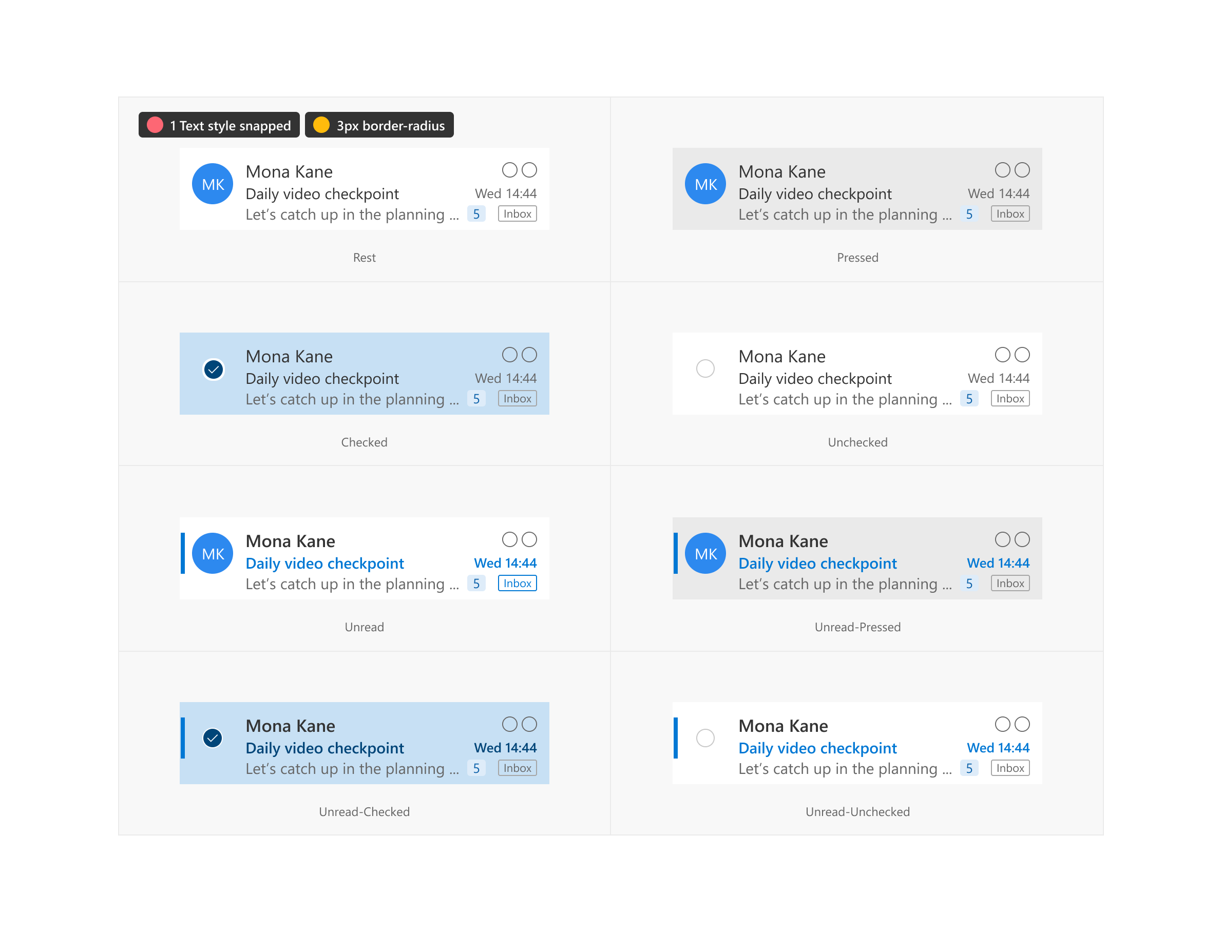
Auditing the production code
As there were instances when we had to release features or make quick bugfixes, there were a lot of design changes that were committed directly to code with no design files to back it up.
This meant that, to be entirely safe, all the UI elements needed to be re-created in Figma from the production code as a first step.
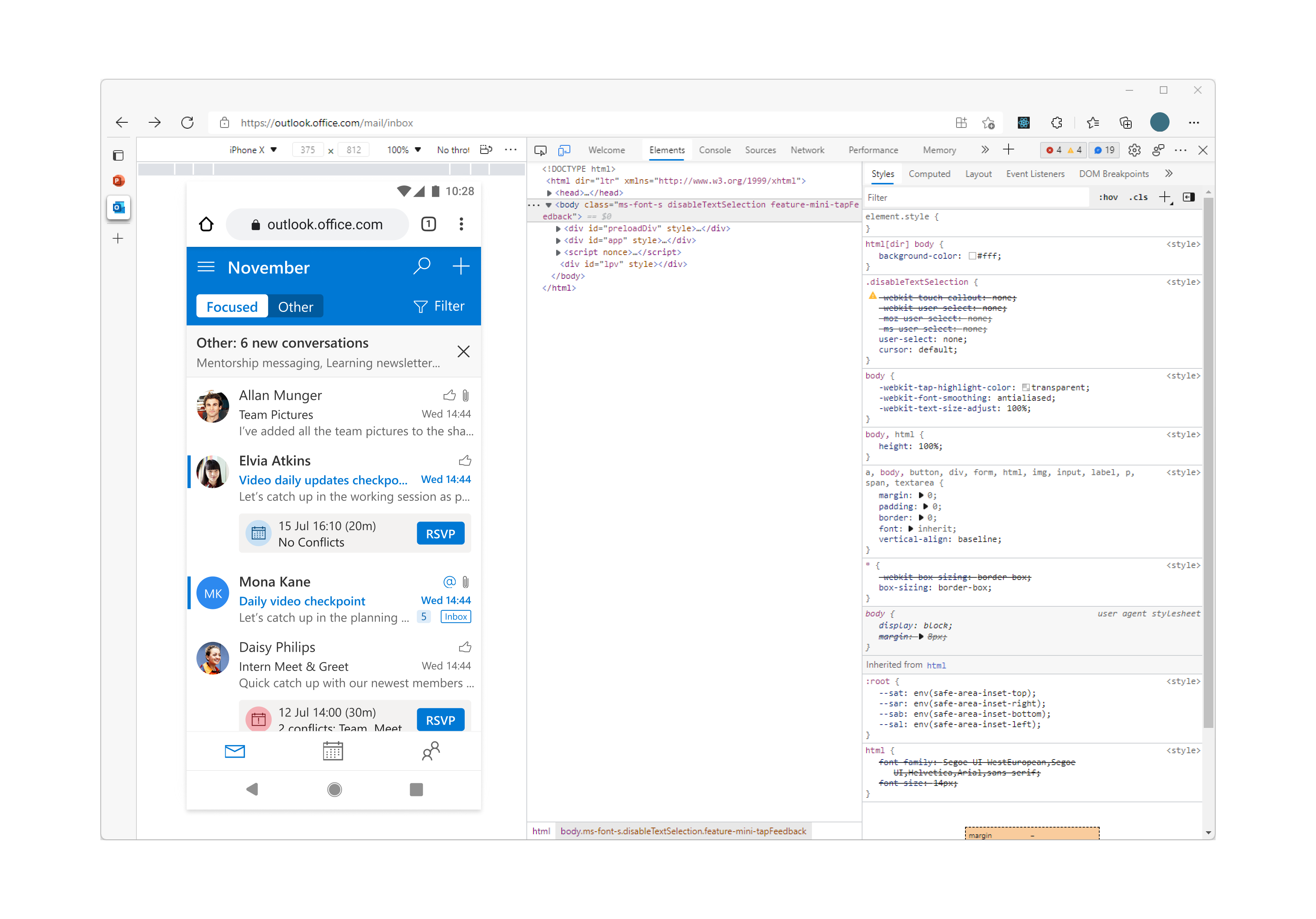
During this process inconsistencies were noted and tracked to resolve — this included inconsistent Typography and colors, as well as irregular usability patterns, legacy styles, and accessibility bugs.

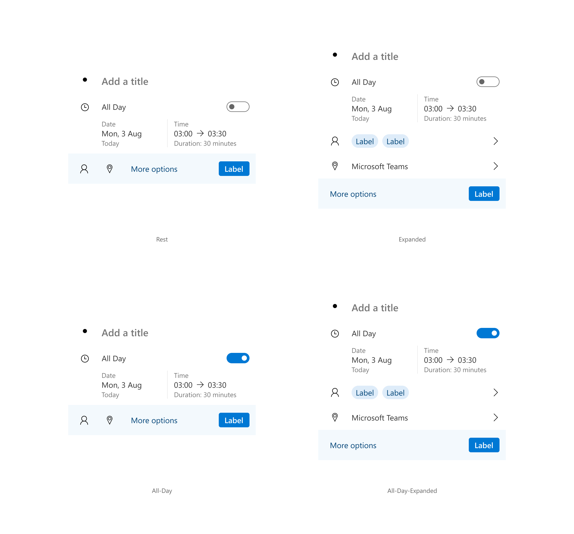
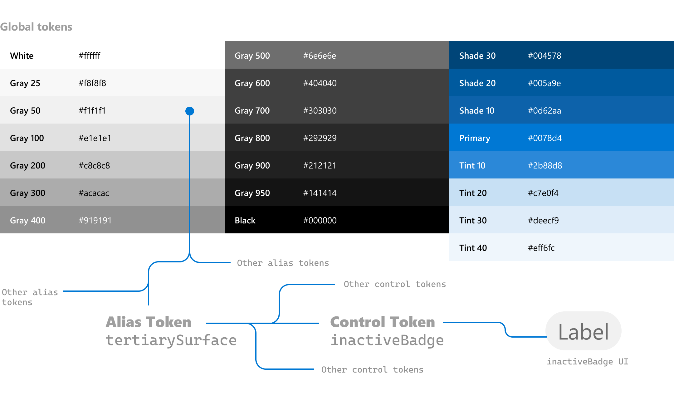
Creating tokens from data
Till now, we had never fully separated the design data from the design of the product.
Colors were used specifically in context and colors were chosen for specific scenarios. For a scalable design system that has just the right amount of wiggle to grow, we needed to de-couple values like colors or type styles from the context they are used in.
These are tokens, and they can be used in varying levels of specificity. However, if the value of the token changes, it'll update everywhere automatically.
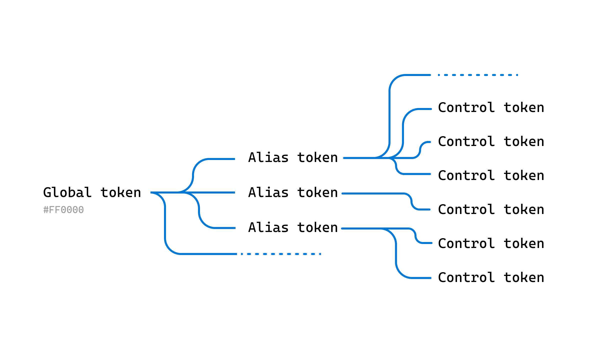
This was proving a little challenging as Figma does not naturally support inheriting values which can then be used as specific control tokens.
The temporary fix was to just document the usage of tokens, but it was not ideal. Figma variables unfortunately cannot inherit the values of other variables for the time being, so we went with documenting the tokens and using that as a reference. Even though figma variables cannot inherit references, TypeScript variables can.
The same holds true for typographic styles as well.
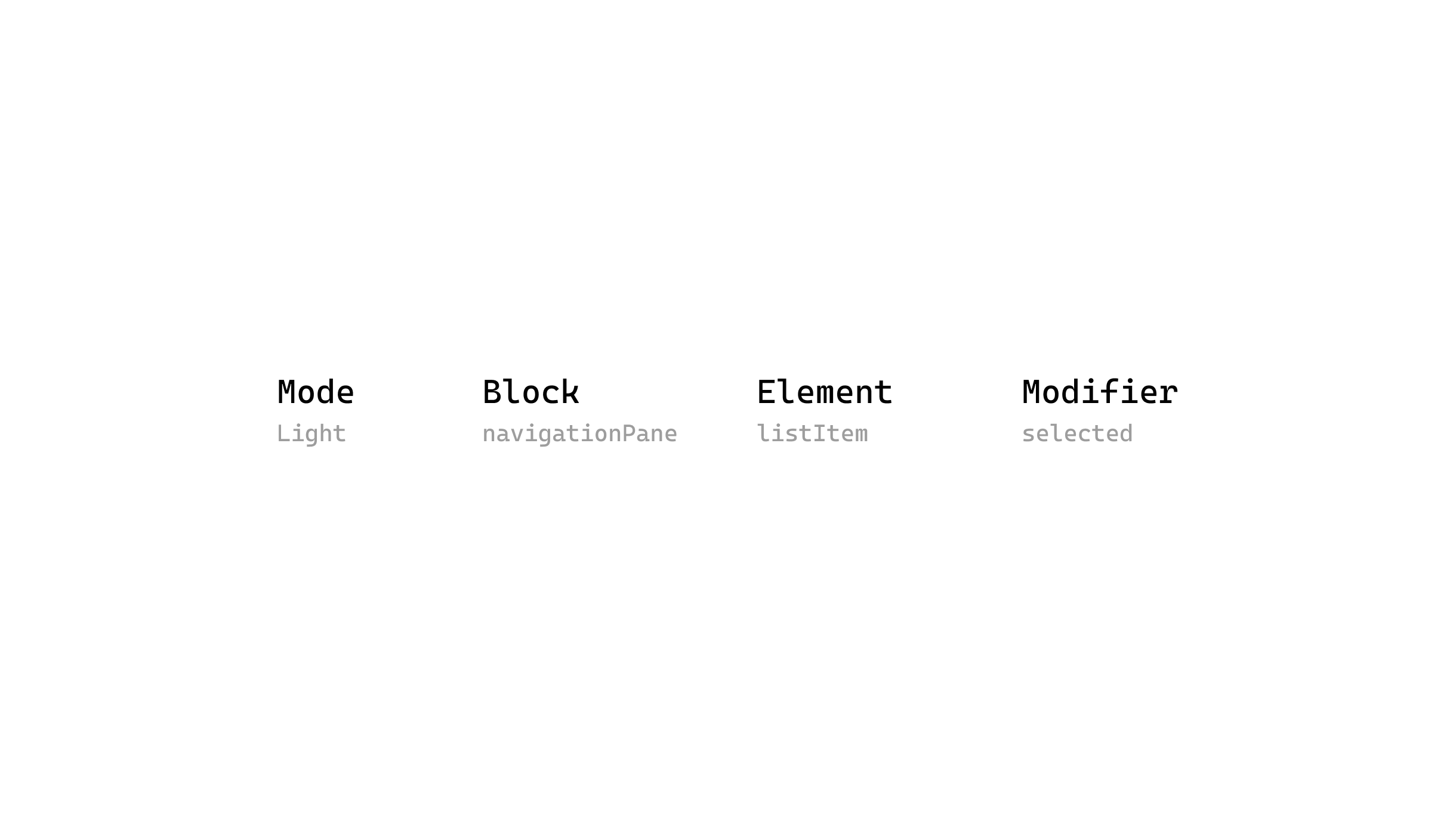
Naming conventions
It's important to have a well accepted, clear, and generalized naming convention in place for a design system.
This proved challenging when we realized everyone on the product team referred to certain UI elements by different names. Pill? Tag? Label? —— We also needed to think ahead and make sure that the naming convention allows for both dark and light variants.
The entire product team got together to finalise on a naming system with commonly accepted names for all the main UI elements with guidelines for naming of any new elements when they are created.
Designer Experience
Designer experience (and developer experience to a large extend) is crucial when it comes to building design systems.
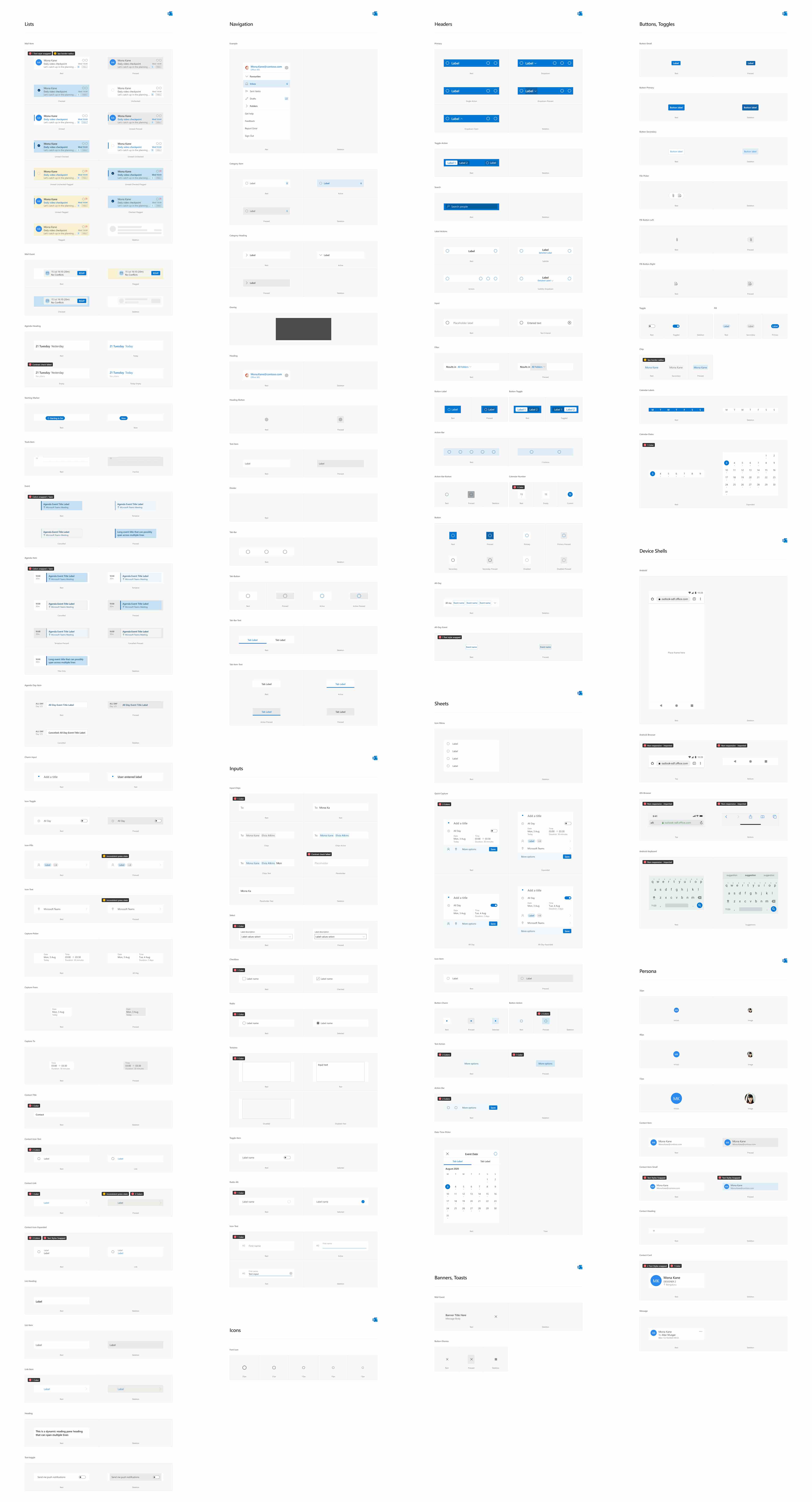
We needed contextual state switching for components and even usage documentation within figma itself. All components, and styles were published as a library with inbuilt documentation.
Would you like to know more?
Most projects showcased here are just sneak peeks into the work that went in and are not case studies.
If you'd like to know more about any of them, drop me an email and we can catch up. I usually respond within a day.
Most projects showcased here are just sneak peeks into the work that went in and are not case studies.
If you'd like to know more about any of them, drop me an email and we can catch up. I usually respond within a day.
hi@naveen.io
Built for performance | See the tech inside →